Skip to main contentSkip to main content
Andrés Morales

Menswear · editorial e-commerce · Bogotá, Colombia

Juan Becerra — editorial menswear storefront with a catalog that reads like a magazine

A premium Colombian menswear label needed a storefront that did not feel like a generic e-commerce template. We rebuilt it as a single editorial experience — mood-driven hero, classic typography, full catalog flow, and a quiet checkout that respects the brand.

Juan Becerra — editorial menswear storefront with a catalog that reads like a magazine

2024 — present

Live since
2024
Region
Bogotá, CO
Type
Editorial
Audience
CO + US

The problem

Premium menswear lives or dies on restraint. The previous storefront was a default e-commerce template — product grid, default typography, no brand voice, and a checkout that interrupted the editorial flow with marketing popups. Visitors bounced from the home page because it looked identical to ten other menswear stores they had visited that day. Conversion was happening, but at the price of brand equity — every purchase chipped away at the reason the customer wanted to buy in the first place.
What I built

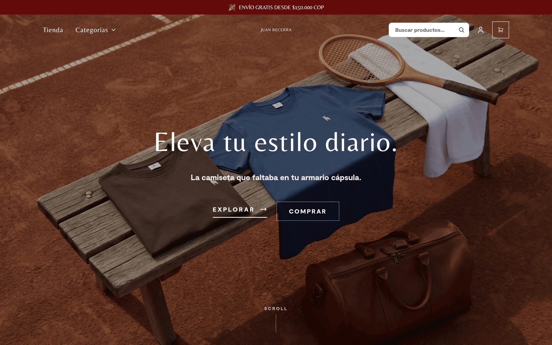
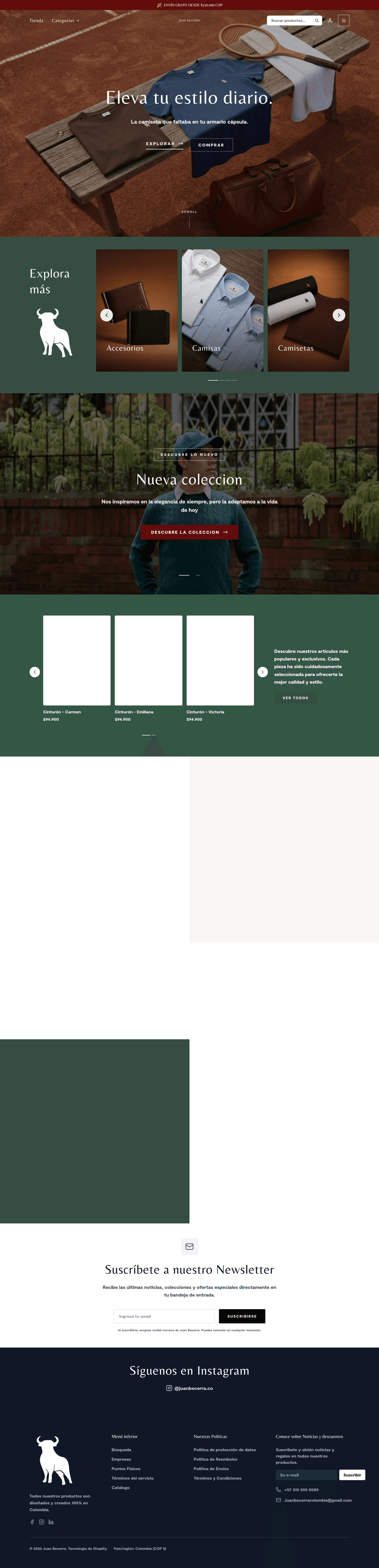
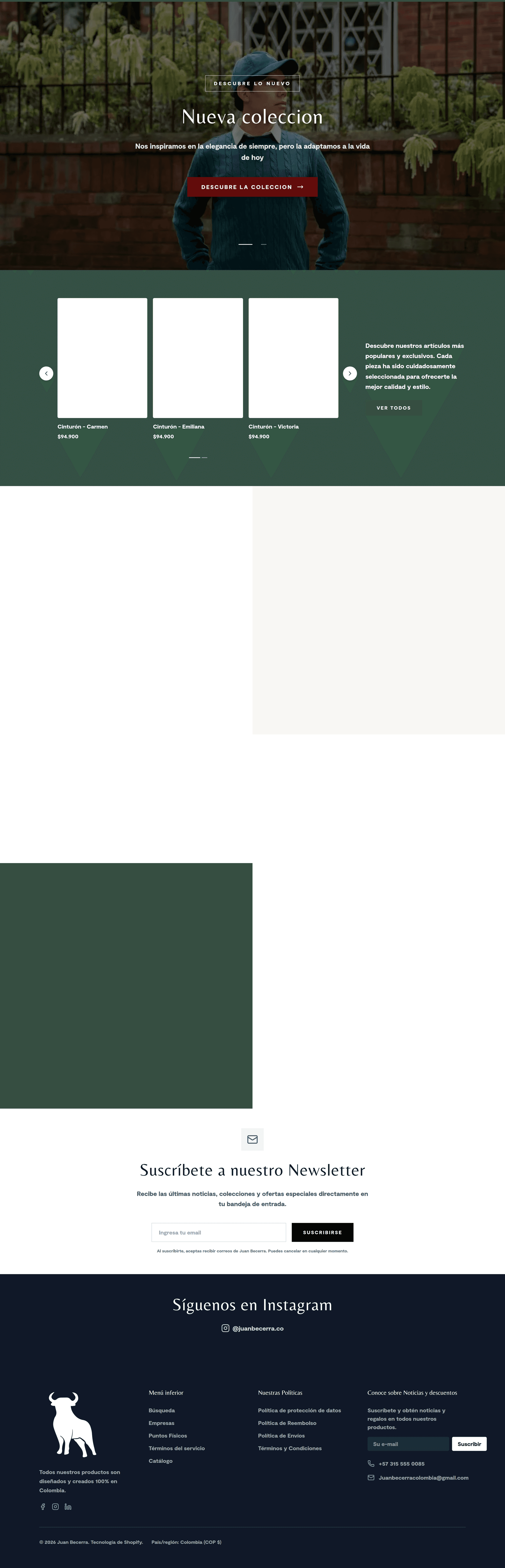
A single editorial scroll replaces the noisy template. The hero is a single full-bleed image with one short line of copy — no carousel, no overlay, no CTA competing with the photography. Categories are presented as a flat typographic grid so the customer reads the brand before they read the SKU. The product page uses the same restrained typography, with a sticky add-to-cart that does not move on scroll. Checkout lives on its own page (no drawers) and removes everything that is not the form, the total, and the trust badge. The result is a storefront that reads like the brand's lookbook and converts like a normal e-commerce site.

Hero — single full-bleed image, one short line, no carousel. Lets the photography do the selling.
Catalog — flat typographic grid so the customer reads the brand before the SKU.
Detail pages — same restrained typography, sticky add-to-cart, no carousels.

Results

1 scroll
Editorial-first
Classic serif
Type system
CO + US
Markets
Editorial
Voice

Scope & architecture

Editorial design system — type scale, color tokens, layout grid
Single-page storefront with anchor navigation between sections
Catalog flow: category → product → variant → cart → checkout
Mobile-first responsive grid with thumb-friendly hit areas
Editorial photography treatment — full-bleed, no overlays, no carousels
Quiet checkout — single page, single column, no drawers

Built with

Next.jsVercelStripeSanity CMSTypeScriptTailwind CSS
AI Automation · UI/UX · Production

Ship the thing.Skip the boilerplate.

Independent practice based in Cali. Automation flows, hand-built UI, and end-to-end web — for teams that would rather have it done than debate it.

Let's talk
2,014Est. 2014

From intake to deploy, the studio keeps work in one place: scope, design, build, ship. Briefs land on the desk, deliverables land on the client.

Andrés Morales

Book a free 30-min callor send a brief